NEW DEMO
Best Fit (Least Squares, Regression)
The objective of this demo is to provide visual foundation and geometric intuition for best fit (least squares) models of data sets of ordered pairs using lines or parabolas. It can be used with precalculus, calculus, or linear algebra courses. The prerequisites include: equations of lines and parabolas, computing the distance between two ordered pairs, and introductory material on building a model to a data set of ordered pairs. The depth of such material is dependent on the level at which these features are used.
File formats gif, jpg, and MP4, are used and should run on most systems. The animations are MP4 files which allow the user to easily control features like stop and go, restart, and change the animation screen size. The controls are similar to those in You Tube. Click this thumbnail MP4_FeaturesThe mathematical development of least squares and its uses have matured over several hundred of years.
"The method of least squares grew out of the fields of astronomy and geodesy, as scientists and mathematicians sought to provide solutions
to the challenges of navigating the Earth's oceans during the Age of Discovery. The accurate description of the behavior of celestial bodies was the
key to enabling ships to sail in open seas, where sailors could no longer rely on land sightings for navigation.
The method was the culmination of several advances that took place during the course of the eighteenth century."
"The first clear and concise exposition of the method of least squares was published by Legendre in 1805 The technique is described as an algebraic procedure
for fitting linear equations to data and Legendre demonstrates the new method by analyzing the same data as Laplace for the shape of the Earth.
Within ten years after Legendre's publication, the method of least squares had been adopted as a standard tool in astronomy and geodesy in France,
Italy, and Prussia, which constitutes an extraordinarily rapid acceptance of a scientific technique."
Click here for
More historical information.
A common problem in a variety of applications is the development of mathematical models for a set of data of ordered pairs \[\mathbf{S = \{f(x_i, y_i) | i = 1, 2, . . ., n\}}.\] One of the first such models that students encounter involves finding the equation of a straight line that in some way "matches" or approximates the data. If it happens that all the data points lie on the same line, then we can find the equation of the line using any two distinct points from the data set; that is any pair of points from \(\mathbf{S}\), call them \(\mathbf{(x_1,y_1)}\) and \(\mathbf{(x_2, y_2)}\), with \(\mathbf{x_1}\) not equal to \(\mathbf{x_2}\). In this case we merely compute the slope \(\mathbf{m}\) of the line segment between the pair of points as \[\mathbf{m = \frac{y_2 - y_1}{x_2 - x_1}}\] and use the point-slope form of the line, either \[\mathbf{y - y_1 = m(x - x_1) \,or\, y - y_2 = m( x - x_2)}.\] These expressions are algebraically equivalent as can be shown by rewriting them in the form \(\mathbf{y = mx + b}\), where \(\mathbf{b}\) is the y-intercept of the line. (If all the points lie on a vertical line, then its equation has the form \(\mathbf{x = c}\), where \(\mathbf{c}\) is the x-coordinate of each of the data points.)
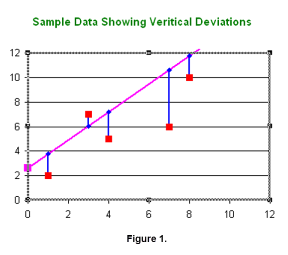
More often it is the case that no single line goes through all of the points. In this case we can develop a mathematical model for the data set by determining the equation of a line that comes closest to all the data points, but need not go through any of them. In order to make this precise we must define what we mean by "closest". In situations where it seems reasonable for the mathematical model to be a straight line, one of the most common definitions of "closest" requires us to minimize the square root of the sum of the squares of the vertical deviations between the data points and the line we seek. A picture of vertical deviations for a sample data set is shown in Figure 1.
|
A line determined in this way is called a line of best fit in the least squares sense, or a line of best fit, for short. The idea is to determine the slope \(\mathbf{m}\) and \(\mathbf{b}\) of the line \(\mathbf{y = mx + b}\) so that \[\sqrt{\sum_{i=1}^n (mx_i+b-y_i)^2}=\sqrt{(mx_1+b-y_1)^2+(mx_2+b-y_2)^2 + \dots +(mx_n+b-y_n)^2}\] is as small as possible. It can be shown that under very mild restrictions that there will be unique values of \(\mathbf{m}\) and \(\mathbf{b}\) that will guarantee that the preceding expression is as small as possible. The development of formulas for \(\mathbf{m}\) and \(\mathbf{b}\) can be achieved using calculus or linear algebra. In some cases the formulas are just stated and a student uses them on faith.
Rather than concentrate on the development of the formulas for \(\mathbf{m}\) and \(\mathbf{b}\), we experiment to develop a geometric intuition for the line of best fit. The idea is to have a data set displayed as a set of ordered pairs in the plane and have a user develop a conjecture for the line of best fit. There are various ways to provide assistance for users to experiment in determining approximations to the line of best fit. Here we illustrate two such techniques.
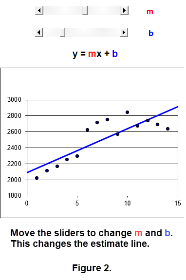
Permit the user to control the values of \(\mathbf{m}\) and \(\mathbf{b}\) using sliders.
Click this thumbnail
![]() for a sample estimate of the line of best fit. By changing the values of \(\mathbf{m}\) and \(\mathbf{b}\) we could move the estimate line.
To illustrate how such controls move the line estimate, Click the MP4 file; you can change to full screen for a closer look.
for a sample estimate of the line of best fit. By changing the values of \(\mathbf{m}\) and \(\mathbf{b}\) we could move the estimate line.
To illustrate how such controls move the line estimate, Click the MP4 file; you can change to full screen for a closer look.
The final frame in this animation is NOT the best fit. Click the thumbnail here
![]() to see the line of best fit for this example. The action to move the line estimates uses a slider for each of \(\mathbf{m}\) and \(\mathbf{b}\). This is illustrated in Figure 2.
to see the line of best fit for this example. The action to move the line estimates uses a slider for each of \(\mathbf{m}\) and \(\mathbf{b}\). This is illustrated in Figure 2.
|
Using the sliders lets you watch the estimate lines change but still relies on your visual opinion to hope you are close to the line of best fit. Lets see if algebra can be used to hone in on the line of best file. In addition, lets try to incorporate geometry to provide an aid to get good estimates of the best fit values of \(\mathbf{m}\) and \(\mathbf{b}\).
Recall that we want to find the values of \(\mathbf{m}\) and \(\mathbf{b}\) that yield the minimum in the expression
\(\sqrt{\sum_{i=1}^n (mx_i+b-y_i)^2}\). Lets focus on \(Z = \sum_{i=1}^n (mx_i+b-y_i)^2\). It follows that \(Z \geq 0\)
and we could use sliders and watch when the value of \(Z\) is the smallest. Keeping track of that set of values is a lot of work and tricky.
To avoid such a set of values lets use a geometric figure that is easier to pinpoint when we are close to the best fit values of \(\mathbf{m}\) and \(\mathbf{b}\).
A square having sides equal to \(\sqrt{Z}\) will work nicely. The square can change its size as \(\mathbf{m}\) and \(\mathbf{b}\) vary in the sliders.
Figure 3 illustrates the ideas of using a square to help pinpoint close values for the best fit \(\mathbf{m}\) and \(\mathbf{b}\).
WARNING:These activities only provide an approximation to the equation of the line of best fit since the sliders are calibrated to select a discrete set of values.
However, careful selection of values for \(\mathbf{m}\) and \(\mathbf{b}\) yield good approximations.
|
|
Using the sliders, hints: Take into account the geometry and algebra of the situation. [1] The way the data appear on the graph indicates how to change the slope \(\mathbf{m}\),
that is, the tilt of the approximating line. [2] The \(\mathbf{b}\) is the y-intercept of the approximating line. So we can change the vertical position of the approximating line.
To get a good approximation of the line of best fit carefully moving each slider is important.
To illustrate using the sliders Click the MP4 file; you can change to full screen for a closer look.
The video was about 1.5 minutes. A few more "tweaks" would probably give us a better approximation. Look at some pictures used earlier. Do you see a better fit? What items in the video can aid you as you move the sliders?Try your "skill" in finding a very good estimate. Click on the MP4 file; record the values for \(\mathbf{m}\) and \(\mathbf{b}\) and the square of the sum of the squares of the vertical deviations.
Start the video again and see if you can do better. It would be fun to have a friend search for a very good estimate and compare their results.We have a collection of Excel routines like the MP4 videos designed as shown above. We used a variety of data sets from Olympic events and U.S. society over a period of time. To execute or download one of these routines click on its title. (You need Excel on your machine to execute the files. The routines in the table first appeared as part of NSF DUE 9952306. Demos with Positive Impact circa 2006. We have modified some text in these routines.)
| Olympic Men's Pole Vault | Per Capita Debt in the U.S. |
| Olympic Men's High Jump | Population of California |
| Olympic Women's Discus | The Shrinking Value of the Dollar |
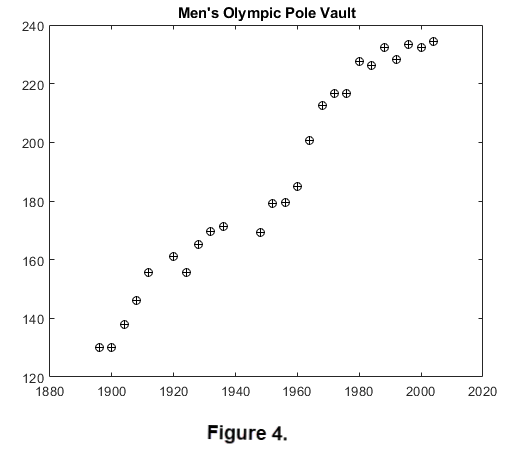
An interesting observation related to sports technology: The winning heights for the men's Olympic pole vault event from 1896 through 2004 are shown in Figure 4. The least squares line to this data will not be at particularly a good fit. (It was easier to use MATLAB for Figures 4 and 5.)
|
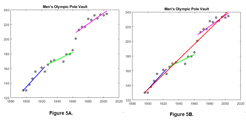
However, lets divide the data into three eras based on the technology used in the event as follows; 1896 - 1924, 1928 - 1960, and 1964 - 2004. Now determine the least squares line for the data from each era. We obtain the individual best fits shown in Figure 5A, which are quite good, and Figure 5B shows the best fit for all the data. (The data for 2008 - 2020 are not used here since they are about an inch from that in 2004.)
|
A bit of history regarding pole vaulting:
Originally, poles were made of ash and from hickory wood. Bamboo poles were introduced in 1904, and both aluminum and steel poles appeared after 1945.
Glass fiber vaulting poles were invented in 1967 by James Monroe Lindler of the Columbia Products Company, Columbia, South Carolina.
The technology involves the pole:
Competitive pole vaulting began with bamboo poles. As the heights attained increased, the bamboo poles
gave way to tubular steel, which was tapered at each end. Today's pole vaulters benefit from poles produced by wrapping sheets of FIBERGLASS around a pole mandrel (pattern),
to produce a slightly pre-bent pole that bends more easily under the compression caused by an athlete's take-off.
Different fiberglass types, including carbon-fiber, are used to give poles specific characteristics intended to
promote higher jumps. In recent years, carbon fiber has been added to the commonly used E-glass and S-glass
preimpregnation materials in order to create a pole with a lighter carry weight. Click here
For more on the pole vault.
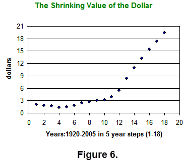
In the Execl routine The Shrinking Value of the Dollar, the graph of the data set is shown in Figure 6. It appears that
|
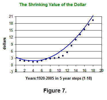
this data may not be well approximated by a line, but perhaps a parabola (a quadratic polynomial) may give better results. To illustrate such an approximation we have included a quadratic best fit for this data. To execute or down load this Excel file click here
| Shrinking Dollar. |
|
Alternative: Using Excel we had to supply the data for the routines based on the topic. To get a feel for estimating lines of best fit we can take another approach.
Using MATLAB we can have a user supply the data set S via the mouse on a grid. Then rather than select values of \(\mathbf{m}\) and \(\mathbf{b}\), the user selects two points
(which need not be in the data set S) in the plane to graph an estimated line of best fit. We can compute the vertical deviations from the data points in S to this estimated line. This requires
we determine a formula \(\mathbf{y = m^*x + b^*}\) from the two selected points. (Note: \(\mathbf{m^*}\) and \(\mathbf{b^*}\) are used for the estimated line of best fit.)
Now we can compute
\[\sum_{i=1}^n (m^*x_i+b^*-y_i)^2\]
for the conjectured line of best fit. Since we have the data set S we can also compute the line of best fit and the corresponding quantity
\[\sum_{i=1}^n (mx_i+b-y_i)^2\]
to provide an indication of the accuracy of the two chosen points that produce the estimated line of best fit.
In a group situation where the same data set is used the conjectured least squares lines can be viewed
by different groups and the sum of the squares of the vertical deviations can be compared. (Teams of 2 or 3 students have worked well in this regard.)
Once the student selections have been completed, the true line of best fit can be given to the groups along with the
minimum value of the sum of the squares of the vertical deviations. It is instructive to have students see the line of best fit on the
same graph as their estimated line. A discussion of the conjectures and features of the process can help students do a better job on a second example.
In order to demonstrate the process and provide a visual model the MATLAB routine lsqgamenew has been used successfully in a variety of classes.
(Of course you will need MATLAB; we updated portions of lsqgamenew since the original version was done in 2000.)
A brief description of this routine follows.
LSQGAMENEW (Least Squares Line Game): An interactive game to select the least squares line to a set S of data. Two guesses for the least squares line can be made using the mouse to select two points that are then connected. The sum of the squares of the vertical deviations from the corresponding estimated line is computed and displayed. The true least squares line can be displayed. The data set for the 'game' can be entered using the mouse, typed in as a n by 2 matrix, loaded from a previously stored data set, or loaded by executing a m-file.
Click on the thumbnail
![]() to see a screen shot of MATLAB file lsqgamenew.
to see a screen shot of MATLAB file lsqgamenew.
Program lsqgamenew can be used as a demonstration involving two players or it can be used with small groups in a lab setting.
It is versatile and easy enough that there is no need to have experience with MATLAB just follow the directions that are shown to start the routine.
It is fun to select data sets containing outliers and observe how the model changes.
The graphical impact from using lsqgamenew is much more dramatic than the algebraic impact from using formulas for \(\mathbf{m}\) and \(\mathbf{b}\)
or the Excel routines.
An extension of lsqgamenew is quadgamenew which determines a parabolic model.
It is played like lsqgamenew, but now three points are chosen to conjecture the parabola that is closest in the least squares sense.
Quadgamenew is useful for modeling simple data sets that arise from 'ballistic style' situations.
Click on the thumbnail
![]() to see a screen shot of the MATLAB file quadgamenew.
to see a screen shot of the MATLAB file quadgamenew.
The lsqgamenew and quadgamenew can be displayed as text which can be copied by clicking on the following table.
| lsqgamenew.m | quadgamenew.m |
LSQ Application:
One of our demos is called Coin Toss Game. A common game at carnivals and fund raisers involves COIN TOSSING.
A common game at carnivals and fund raisers involves COIN TOSSING.
There are various forms of such games. Click the thumbnail
![]() to see a hand carved coin toss "board". It is hard to see but the small holes in this board are different sizes since coins may have a different diameter like modern "change". Such boards
make it difficult to determine information how to toss winners. (A carnival board is usually much larger than this antique.)
to see a hand carved coin toss "board". It is hard to see but the small holes in this board are different sizes since coins may have a different diameter like modern "change". Such boards
make it difficult to determine information how to toss winners. (A carnival board is usually much larger than this antique.)
The game we investigate in this demo consists of a board with a grid of uniform squares as shown in Figure 1 (from that demo). The objective of the game is toss a coin onto the board. If the coin lands entirely within a square then you win a prize, otherwise you lose your coin. In Figure 1 the red circles indicate winners.

To see a Coin Toss Simulation click on this thumbnail
![]() .
You may notice that the toss of a coin onto the board often does not fully lie in a square. We will use two different boards, one 4 by 4 and the other 5 by 5. The size of the board may
play a role in accumulating circles that fall completely inside a square. To get a feel for simulating a coin toss game by tossing a variety of the number of coins, we suggest you try both of the
following activities (available in this demo).
.
You may notice that the toss of a coin onto the board often does not fully lie in a square. We will use two different boards, one 4 by 4 and the other 5 by 5. The size of the board may
play a role in accumulating circles that fall completely inside a square. To get a feel for simulating a coin toss game by tossing a variety of the number of coins, we suggest you try both of the
following activities (available in this demo).
In this demo there is a formula, which is a quadratic polynomial, that can be used to approximate the probability of tossing a winner.
Using the Monte Carlo method to gather data lets us generate a second quadratic polynomial via least squares.
To compare the two estimates we make graphs. (To learn about the Monte Carlo method click on
Monte Carlo Area Simulations, another demo in our collection.)
To learn more about this COIN TOSS demo click here
Coin Toss Game.
A Related FUN item:
A bit of a summary. Previously we used data gathered from resources like Olympic games and U.S. society data over periods of time. The data was used to generate a best fit for lines (polynomial of degree 1) and parabolas (polynomial of degree 2). We then let users choose data on a grid from a mouse which lead to two games. The games often can help aid users to find good approximate best fits.
As another "fun" application that uses similar tools, consider a picture of a real world that contains a curve. For example arches, bridges, fountains, and roller coasters. Using a grid imposed on the picture we can collect data to determine a polynomial approximation to the curve in the picture. Since pictures are real world it is most likely that there is no polynomial equation for the curve so we can't compare our approximation to a best fit. Here we will show several examples. The software is similar to that for our best fit idea, and can be used to approximate the curve in the picture several times.
Consider St. Louis’ iconic Gateway Arch Discover which provides amazing views from the top – at 630 feet.

|
To see an example of the result of Using a grid imposed on the picture we can collect data to determine a polynomial approximation to the curve
in the picture. click the thumbnail here
![]() .
.
If you looked at the thumbnail above you should see that the parabola that was generated didn't "hug" the arch. We could choose another set of points to try to get a better fit.
Also note that the equation of the parabola is shown. But infact, the arch itself is not a parabola.
"It's a catenary. It's the shape you get if you take a chain, a long, thin chain, and you hold it out between your two hands or between to posts
and let it sag in the middle. It's the shape the chain will take when it sags down due to gravity. That means if you turn it upside down,
it's the most efficient shape if you want to make a large stone arch like the St. Louis arch."
"A catenary is a much more complicated equation (than a parabola). In fact, you need to use calculus in order to figure out the equation of a catenary."
For more information regarding that people, including Galileo, often think the parabola and the catenary look alike to the naked eye click here
Parabola \(\neq\) Catenary.
The parabola we generated as an approximation to the catenary arch used a rather simple MATLAB file. Click on the following item to see the MATLAB file displayed as text which can be copied. WARNING: you will need to supply the "picture". We left the picture for the St. Louis arch in the code. You can change the file name as needed.
| StLouisARCH2024.m |
For an outline and more examples of pictures containing curves that are easily approximated we have created a slide show for FUN. To view the slide show click here Slide Show.
CONNECT the DOTS:
Connect the Dots is another demo in our collection. The idea of connecting dots (ordered pairs on a grid) has a variety of meanings. A simple meaning relates to a child's puzzle consisting of a sequence of numbered or alphabetized dots for a picture. The result of following an ordering to connect the dots yields a path from the first dot to the last dot.
Another meaning of connect the dots is interpolation which is related to areas in STEM (Science, Technology, Engineering, and Mathematics). A good description of interpolation is available; click here WIKIPEDIA . A portion is summarized below.
"In the field of numerical analysis interpolation is a type of estimation , a method of constructing (finding) new data points based on the range of a discrete
set of known data points. In engineering and science, one often has a number of data points, obtained by sampling or experimentation, which represent
the values of a function for a limited number of values of the independent variable. It is often required to interpolate; that is, estimate the value of that
function for an intermediate value of the independent variable."
"A closely related problem is the approximation of a complicated function by a simple function. Suppose the formula for some given function is known,
but too complicated to evaluate efficiently. A few data points from the original function can be interpolated to produce a simpler function which is still fairly close
to the original. The resulting gain in simplicity may outweigh the loss from interpolation error and give better performance in a calculation process."
This demo compares two interpolation techniques using cubic polynomials. We explain the math for each technique. For more information on this demo click Connect the Dots.
NOTES
- This demo is a modification of a demo in the project Demos with Positive Impact , National Science Foundation's Course, Curriculum, and Laboratory Improvement Program under grant DUE 9952306. managed by David R. Hill and Lila Roberts. The project was based on submitted ideas from instructors. The original demo appeared in 2006.
- Special thanks to Deane Arganbright of University of Tennessee at Martin and to Walter Hunter at Montgomery County Community College for their assistance. The book "Mathematical Modeling with Excel", by Erich Neuwrith and Deane Arganbright (Brooks-Cole) provides a rich source of information for developing Excel routines for mathematical instruction.
- Send us an email if you want the MATLAB files used in this demo.
Selected Resources
- An in depth discussion of least squares
- Good discussion of Advantages and Disadvantages of the Least Squares Method
- Desmos
- Desmos
- Desmos
- Desmos
- Least squares in java script
- Some animation to help understand least squares
- Formulas for m and b in y = mx + b
- Calculator for m and b in y = mx + b
- Pole vault
- Olympic results
- The Gateway Arch is NOT a Parabola
- A lot of background about the Gateway Arch
- Quite a roller coaster